


Listen to this article
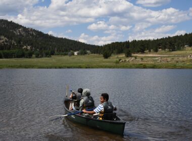
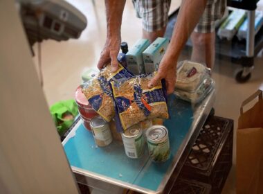
When it comes to natural disasters, the hope is that help from professionals will always be readily available. But after a hurricane, flood, or wildfire, especially in the immediate aftermath, local resources might be overwhelmed. That’s why having a personal disaster plan and supplies is crucial.
For many people, preparing for disasters can be a bit daunting, to say the least. What should you put in the disaster kit? What’s your communication plan? How can you make your home more disaster-resistant?
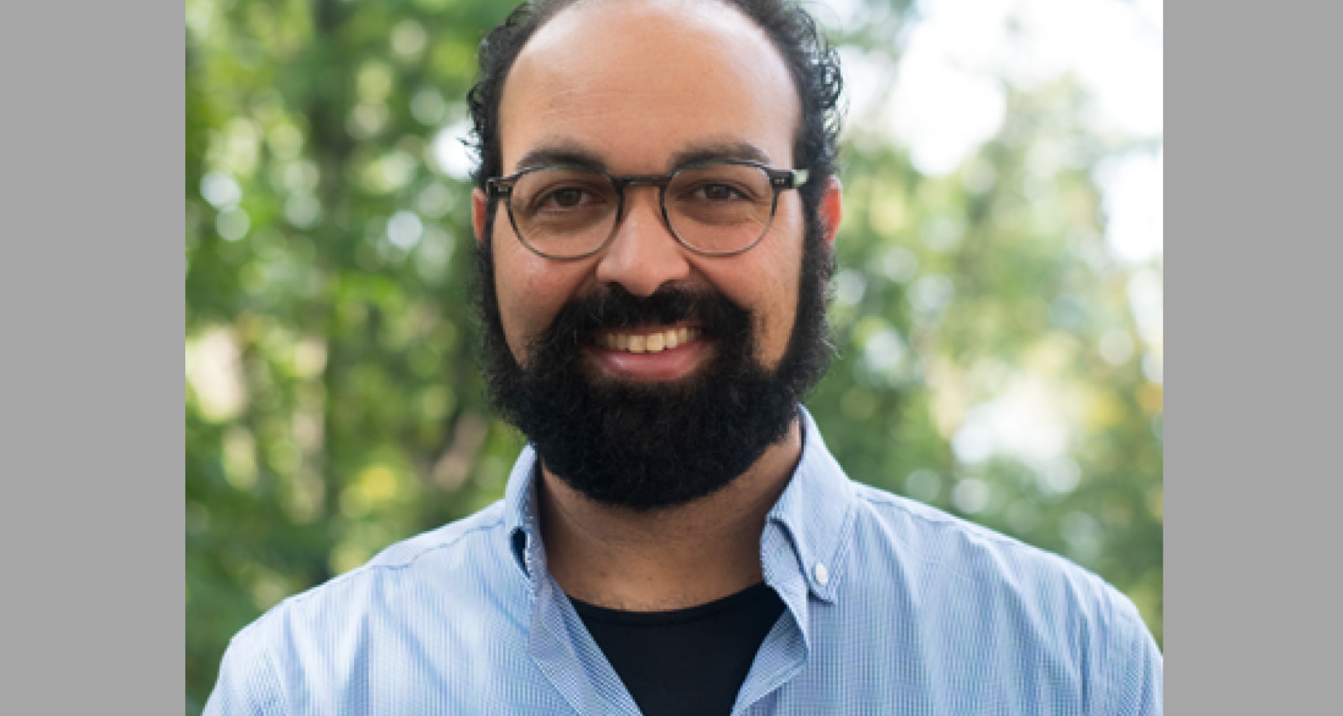
A good start to crafting a plan is knowing the risks you should be prepared for based on where you live. That’s a big part of Jonathan Sury’s work.
Jonathan is the Project Director for Communications and Field Operations at the National Center for Disaster Preparedness. Jonathan is currently pursuing a doctoral degree in Population and Family Health at the Mailman School of Public Health at Columbia University. He also holds a Master of Public Health degree in Environmental Health Sciences from Columbia, specializing in Environment and Molecular Epidemiology.
Notably, Jonathan leads a project called the Natural Hazards Index, which maps local vulnerability to various disasters at the sub-county level. Everything including extreme heat, earthquakes, landslides, tornadoes, and floods. The project’s interactive map is accessible to the public. It allows users to zoom in and assess climate, weather and geological hazards in their vicinity. This tool provides comprehensive risk assessments down to the census tract level. That way, people can learn to take proactive measures to safeguard themselves and their families.
Today we’re talking with Jonathan about the Natural Hazards Index, the importance of preparedness, how data can help individual households and communities alike, and what we should be paying attention to amid the changing disaster landscape.
Show highlights include:
- The revamped natural hazards index map provides valuable information about the risks people face in their own communities.
- Disaster preparedness is not solely an individual task; it requires community involvement and support.
- Emergency services may not be able to immediately respond to everyone’s needs after a disaster, so individuals and communities should be prepared to take care of themselves and their neighbors.
- Future plans for the map include integrating climate change projections to better understand how hazards may change over time.
Listen and subscribe to the Do Gooders Podcast now. Below is a transcript of the episode, edited for readability. For more information on the people and ideas in the episode, see the links at the bottom of this post.
* * *
Christin Thieme: Well, Jonathan, welcome to The Do Gooders Podcast. Thank you so much for joining us today.
Jonathan Sury: Thank you. Pleasure to be here.
Christin Thieme: As we get started, can you tell us a little bit about your journey into this field, and what led you into emergency management at all?
Jonathan Sury: I never thought I would end up here. It’s kind of a bunch of happy accidents, I think. I originally was exposed to public health preparedness through my master’s degree. I have a master’s degree in public health. And at the time, there was a study that was being run after Hurricane Katrina. This was back in 2007, and I was volunteered to be an interviewer to follow up with about a thousand different households that had been displaced by Hurricane Katrina.
At the time, we were enrolling them into a study and tracking them over time to see how they were faring and how they were recovering. And this was the second interview after, what we call the baseline study, and kind of was given an opportunity to actually go help and find people for this study in New Orleans and the surrounding areas. And so, I got to, very soon, in my educational career, travel to a post-disaster setting, and knock on doors, and talk to people, and interview them, and find out where they went, to get them interviewed into the study.
And so, from there, it has been an interest area of mine, and I think it’s a very unique space that, prior to Hurricane Katrina, didn’t receive as much attention, as a real turning point in this country for realizing how important preparedness was and how complex it can be, especially when you have natural disasters affecting communities that have been disenfranchised and affected in many different ways, and marginalized in many ways over the years.
So, it’s kind of a really interesting confluence of various different disciplines from engineering to social science to public health, and it requires expertise from so many different disciplines to come together, to really truly respond to communities’ needs after disaster.
Christin Thieme: And you got that firsthand view of it, which is interesting that that was your avenue and is really that human-to-human connection. I know, over the course of your career, you’ve contributed extensively to all kinds of disaster-related research, including on child-focused preparedness, which is something that we don’t necessarily hear a lot about in this space. Can you explain a little bit about what makes the child-centered model unique?
Jonathan Sury: The child-centered model of preparedness is definitely unique. We’ve always been interested in children at NCDP, and the way that they are affected by disaster, and particularly from a medical standpoint, particularly after Katrina when we’re dealing with areas and hospitals that have low resources and how you manage the specific requirements that children have for emergency healthcare. Children require different size tubing and different size syringes and ventilators and all kinds of different things that makes their care very unique. But their needs extend beyond just healthcare, and we find that children are very much dependent upon many different sectors within a community.
And so, kind of fast-forwarding several years into a partnership that we had with Save the Children called, the Resilient Children/Resilient Communities initiative, we piloted a model of child-centric community preparedness that was based off of some research that came after Hurricane Katrina, that basically posits that children are the bellwethers of recovery. And so, if you want to see how a community is doing after disaster, you look to see how the children are doing, because they are dependent upon so many different systems.
And so, we were able to take a multi-sectoral approach that spanned emergency management, child care centers, family child care homes, foster care agencies, other community-based organizations that provide wraparound services and several other specific sectors within there, to bring them all to the table and say like, “How can we strengthen all of these systems that help take care of children on a daily basis, to make sure that they are resilient during a disaster?” And I think that is the unique approach to that model, in particular, is that there are just so many other systems that need to be set up correctly to handle the children’s need, and they’re not all talking to each other all the time.
Christin Thieme: There’s a lot at play, of course. That’s an interesting way to look at it. I’ve never heard about measuring how the children are doing, but that makes so much sense. It’s really interesting.
I know one of the bigger projects that you’ve worked on, which we’re going to kind of dive deep into, is the revamped natural hazards index map. On a fundamental level, the goal of the index was to help people better understand the risks that they face in their own backyard if I understand it correct. At what point did it become apparent that the typical American household needed better resources to help assess and plan for these kind of natural risks?
Jonathan Sury: Household emergency preparedness is always challenging. It’s challenging to convince people to get a kit together. It’s challenging for people to be able to even have the resources, sometimes, to be able to get a kit together. And so, many years ago, the center put together a tool called the Preparedness Wizard, and it was meant to be a step-by-step process that kind of said, how many people were in your household? How many children? How many older adults? How many pets do you have? How many people do you have on medication? Kind of walked you through a step-by-step process to develop a household emergency plan, filling it out as you go. Part of that was just having some context of what types of disasters were potentially present in your area.
At the time, we were utilizing presidential disaster declaration data, which occurs at the state level, but that was not necessarily granular enough for people to really understand what may be in their own backyard. Because you could be coastal and have a tsunami risk, and you could be inland and have no tsunami risk, but you’re still in the same state, so it’s not necessarily relevant.
And so, we set out to make a county-level version of that map, and we did that, and found out that it was very well-received by the public, and it has been one of our most popular products that we’ve developed over the years and got to the point where we realized that we needed potentially even more granularity, something that gives us within county differences, and a better look at how things differ across states and across state lines.
And so, that’s when we went through this version 2.0 update that we just did, and also included some additional hazards, so we now have 14 different hazards that are included in this map. Most of them are based off of publicly available data sets, some of which we kind of curate and create ourselves. Others are just reprocessing places like USDA and USGS and the fire service have put together, and reworking them into what we hope is an easily communicable fashion of very low to very high hazard rating.
Christin Thieme: You mentioned that the map illustrates the hazard level of 14 different natural hazards. So, that’s extreme heat, earthquakes, landslides, tornadoes, floods, things of that nature. It sounds like a massive undertaking to put together all of this data into one easily readable tool. Can you talk a little bit about the behind-the-scenes of the work that went into actually building it?
Jonathan Sury: We went through, I would hope, a fairly rigorous process of going layer-by-layer and speaking to experts that are hazard-specific experts on each of those different hazards. So, like you said, wildfire and volcano and tsunami and tornado. So, we reached out to federal agencies that specialize in these topics as well as other academics who are kind of doing cutting edge research on the topics, and spoke to them, and tried to understand what the current state of the data sets that are out there are, which ones might be more appropriate for our needs.
One thing that we really try to do in this version 2.0 was expand the reach of the data set to include Puerto Rico, to include Hawaii, to include Alaska, which are often left out of some of these data sets as are other territories like Guam. And unfortunately, we are not always able to include all of the territories, because there’s, sometimes, not enough federal resources to create the data sets that they need, or there’s local variations that are just not funded to be created.
So, yeah, we went through a very kind of rigorous process of speaking to experts, of reviewing data sets and technical documentation ourselves. For example, the wildfire hazard data is based on the wildfire risk to communities’ data set, that’s put out through USGS. They have five or six different indicators that can be used, that talk about fire hazard, but we had to choose the one that fit our needs the best, that communicated something about intensity and severity, not just a burn probability, because being able to communicate a severity and intensity is more important than a probability of a burn, which has no, necessarily, strong implication for how somebody should prepare.
And then, once we gathered all the data sets and we downloaded them, we had to account for the different spatial resolutions of each one of the data sets. Sometimes, for our extreme heat data set, we’re accessing very, very large databases of daily weather data for, in this case, 40 years worth of daily weather data, which gets processed, and we calculate a heat index, and then we calculate, from there, a percentile. So, each layer has various different calculations that are made, and then we categorize everything after that.
So, yes, a lot of behind-the-scenes processing and working with other producers to get the right variables that we needed, and then just a lot of data management.
Christin Thieme: And you said, it, previously, was only at the county level, but this new one, you’ve brought down to the census tract level, I understand. Why was that so important to do?
Jonathan Sury: Getting data down to the census tract level allowed us to see heterogeneity or differences within counties that we wanted to be able to see. And not all counties are the same size in the U.S. as all census units are. The more densely populated they are, the smaller they are. And so, we have, sometimes, some areas that are very, very large counties, that may have a population that is on one side of the county, and so the hazards faced at one end of the county may be completely different than the other end. And so, it’s being able to see, at least, some variability or some variation within those counties, is what we were hoping to accomplish with this new version, to show that there are differences within counties.
Christin Thieme: And kind of along that same train of thought, does the map also account for seasonality? For instance, I assume, the drought risk wouldn’t be as high in January as it would in July, maybe. So, does it take that into account as well?
Jonathan Sury: We do not have a product that shows, here’s what summer fire risk is versus non-fire risk. It is, I would say, true composite of everything. For example, in the drought layer, we have tens of years of weekly drought maps that are basically overlaid upon each other, and we take an average across all of that seasonal variability. So, we don’t necessarily count for that. I will say that, for extreme heat layer, for example, we know that there are decadal differences in heat, and so we accounted for that in our analysis by comparing the last 20 years with the 20 years before that, and looked for the anomalies across those previous 20 years. And so, we did try and account for some variability in that regard, but like fire, it doesn’t account for seasonality in that way.
Christin Thieme: Did anything surprise you when you looked at all of this hazard data?
Jonathan Sury: I think there is a challenge of working with national data. We talk about this a lot. And there’s sometimes where you’ll show the map to somebody and they’ll say, “Well, that’s not what my backyard looks like” or “That’s not my reality.” And there’s some truth to that. And I think it’s a challenge that we face of taking a big step back and saying, “What’s going on in the whole U.S.?”, “What’s going on within my state?”, and trying to find the best tool to be able to compare when we’re looking across large areas.
So, I think there’s some local information that’s lost, that really has to be supplemented by individuals and households and local emergency managers who have that other information. For example, the fire maps that we have become irrelevant if a homeowner has really done due diligence and made strong efforts to reduce risk for fire, by having good mitigation around their property. And so, those individual-level property mitigation measures are not going to be reflected in the tool. So, there’s a little bit of that like, how do I interpret these data? How do I make sense of these? That, I think, is a little bit challenging, sometimes, when we have these big data sets. So, I would say, that is certainly one of the surprises, in a way, that we saw.
And I think another thing is just the fact that there is no complete uniform approach to each one of these hazards. They’re all a little bit different.
Christin Thieme: You touched on this, but it’s such an incredible tool. I want to talk a little bit about how individuals and households can get the most out of it, to inform their own decision-making as they think about their own preparedness. So, for instance, if you zoom in on Santa Barbara, which is not far from us, in California, the hazard score for tsunamis is rated a five out of five, meaning a very high risk. But that doesn’t mean that there’s necessarily an imminent risk of a tsunami striking the area, right? So, how can a user be sure that they are reading between the lines when they look at this data? How can they best use it?
Jonathan Sury: It’s a very good question. And tsunami is an interesting one as well, because there’s no index that gives you a continuous rating of your tsunami hazard. What we’ve done in here is that, either you’re in a tsunami zone or you’re not, and we gave it a high rating because that’s the worst-case scenario in that regard.
In each of the layers, we do include some documentation, so there’s some interpretation of the values that are in each of the layers, and so if you click on a specific census tract on the map, you get a little pop-up. And when there’s data, it’ll show the data. If there’s no data, so if there’s no hazard, it’ll be empty for the values and for the hazard categories. But it does give you what those values are or how to interpret those values and any limitations within the dataset, and we have that in our documentation as well.
And so, certainly reading the documentation and looking at, what are the limitations of this, and what are the interpretations of this, that I should be making? And I think we often look at these maps and these models. We talk about this a lot when we do climate modeling and hurricane modeling and things like that as it’s not a crystal ball, there’s going to be something that’s not accounted for, there’s going to be, potentially, an anomalous event, there is going to be variability. But knowing that there is a potential for some degree of a hazard, can tell me, as a citizen, to be a little bit more prepared in a certain way.
For example, if I know that there’s a potential for wildfires in my area, I may want to make sure that I have some N95 masks in my car, I may want to make sure that I have a radio where I can get radio transmissions, I may want to make sure that my go kit is ready to go in my car because I may need to evacuate very, very quickly.
If I know that I’m in a cold weather hazard area, I may want to make sure that I have something warm in my car, in my go bag, that if I have children with me, that we have something to keep them occupied, especially if we’re going to be stuck at home because the POWs can’t come and clear us out or something like that. So, each one of these hazards does have a specific implication. There’s, I think, a little bit of a debate in the emergency management community of all hazards preparedness versus specific hazards preparedness. There’s a lot of all hazards preparedness that applies for every one of these, but there is unique context for each of these hazards. If you’re at the beach and there’s a tsunami warning, you’re not going to get to your car, you just got to get to high ground, and you got to know how to get to high ground.
So, there’s understanding some of the physics even, and how quickly these events occur. This makes a big difference. And tornadoes are another one where knowing the difference between a watch and warning can make a big difference for you. Those are very different messages that are trying to be communicated. So, in the documentation, there’s also a separate tab called, the resources, and we did our best to assemble a handful of preparedness resources that are hazard-specific. So, some of them just talk about the physics and the science behind them, and some of them are what you can do to be specifically prepared for that type of hazard.
Christin Thieme: That’s really helpful. What type of feedback have you gotten from people who’ve used the tool? And do you know of any way that it’s being factored into conversations, that could potentially influence policy around this arena?
Jonathan Sury: It’s a good question. I think we always hope that data like these go into policy. There’s another product called, the National Risk Index, that FEMA puts out, which is very similar to this, in some ways. The key difference, and I think this is an important differentiator to really understand, is ours is specifically focused on the hazard.
We talk about risk. Risk is a function of hazard times vulnerability, at times exposure, and if you divide all of that by resilience, that’s the full calculation. And that’s exactly what FEMA has done with their map, is they’ve taken the hazard data, they’ve taken hazard loss estimates and casualty estimates, they’ve integrated the social vulnerability index data as well as some resilience data from the data set called, BRIC.
And so, they’ve fleshed out that whole calculation, and what they do is they compare one place to another, saying like, “This place is riskier than this place.” And so, it’s a ranking approach, and we didn’t want to do that. We wanted to just focus beyond the hazards and have it not say that, “This place is the worst in the country.” Right?
And so, what we hope people can do with this is, one, get their household preparedness kits together. Two, to have the right questions to ask their emergency management agencies. Every county has an emergency management agency. Every agency has a plan for all different hazards, and they have to do hazard mitigation assessments that really go through every one of these hazards, and say like, “Here’s where the riskiest places are. Here’s what we’re going to do about it. Here’s what we’re doing about it.” And those also exist at the state level. And these are all tied into getting relief dollars in the event of a disaster.
These things are definitely in place. So, we want people to be empowered to ask the kinds of questions of, what are the fire mitigation strategies that are being employed in my community? What flood mitigation strategies are being employed? What could I do to mitigate against flood hazard on my own property? And what funding might be available?
So, in some ways, they’re educational tools, but they’re also advocacy tools, and I think this is where other organizations, even Salvation Army and other community-based organizations who are involved in advocacy for their community can use these type of data, to say like, “Here’s what the hazard profile is for my neighborhood.” And neighborhoods may cross census tracts, they may cross county lines, but that’s a general feeling of what may be present in my certain community.
So, I hope that they’re used in those ways. I can’t say for sure if they’re getting to a federal policy level or a state policy level, but they certainly help tell a story.
Christin Thieme: You’ve been in this field for a long time now. What are some misconceptions or common myths that you’ve come across in your work about disaster readiness and preparedness that you would want to set the record straight on?
Jonathan Sury: These are going to sound very different, but I’m going to say them anyway. Preparedness is not solely an individual task. It can’t be upon every individual to get fully prepared, it’s going to take a community. And we have to rely on each other, at some point, and we are going to rely on each other, at some point, there is just a limitation of what emergency management and emergency services is going to be able to do after disaster. And so, we have to take care of our neighbors. We have to take care of the people that can’t take care of themselves. That could be financially, it could be physically, in an access or functional need, people who can’t exit their home by themselves. And so, we have to treat this as a community effort to check on our neighbors, to check on our family members. There are so many different ways to do that. Even when phone lines are down, we have ways to do that now.
And there are low tech ways of just walking next door and starting these conversations now, I think, is the thing. And maybe people feel awkward in doing that, maybe they don’t feel comfortable asking their neighbor, but this is the time to do it, start now, and don’t feel like you need to shoulder that whole burden yourself. And I’ll say the flip side of that is that, what I just kind of alluded to is, there aren’t enough resources to save everybody right away after disaster. So, everything that we do to help protect ourselves, and help protect our community, and hang out a little bit longer in safety, will allow emergency medical services and emergency management to get to the people that really, really, really are going to need help right after disaster.
And I think that is a little bit of a misconception is like, “Oh, well, if I call 911, they’re going to be here”, and they will say that they cannot do that. It’s not possible. So, there are two kind of sides of the coin, but I think they add up to how we need to be thinking about these things.
Christin Thieme: Yeah, and really important distinctions. Aside from individuals and households, who else benefits from the Natural Hazards Index? How does the map maybe account for projections on what future hazards might look like? Anything kind of forward-thinking?
Jonathan Sury: Well, it’s interesting that you asked that. We are in the process of our second phase of this project. We are actually going to be integrating climate change projections into specific hazard layers. We’re still working on figuring out which hazards those are, but we’re at least planning to include tropical cyclone projections up through the end of the century, with different climate change scenarios. We’re hoping to include something for tornadoes. We’re working through some brilliant researchers who are the preeminent modelers of tornadoes, and hopefully a couple of others. We’d like to include something for flood and for wildfire, but there’s some challenges in there. I think this is kind of the next generation of where these type of data are heading, is integration of climate change models and projections. And we also don’t know exactly how climate change is going to affect some of these different hazards in ways that we haven’t fully thought about.
Some things are predictable. We know that moisture content and intensity of storms can definitely be affected by climate change. But even little things like volcanoes, so as ice caps and ice on volcanic areas is melting, it can actually change the direction of the flow of the lava or the lahar, the kind of dirt and mud that gets released in an eruption. And those are kind of less explored areas, but that is what we’re hoping to do in this next phase, and kind of get people thinking about how might this hazard profile change over time. And things are set to change from what we can tell by the end of the century, particularly if our carbon emissions aren’t decreased.
Christin Thieme: Something to keep our eye on. We will definitely be linking to this index so everybody can take a look at it and see what the hazards are in their own backyards. And then, like you said, think about how we can better prepare our own households and how we can be part of preparing our community.
Jonathan, thank you so much for sharing with us today for the work that you’re doing and for giving us a little bit of insight into this incredible tool and how we might be able to use it. Thank you.
Jonathan Sury: Great. Thank you for having me.
Additional resources:
Listen and subscribe to the Do Gooders Podcast now.